Due Today: 2 kinetic type examples and reflection; begin exploring 3 audio selections (30s–60s) – not due until Tuesday
For Today: Review Medium; Kinetic Type; Review Kinetic Type Examples; Demo: Intro to After Effects; mini group discussions for P1 audio selections
Design Kinetic Type Research F25.pptx
1-introduction-to-motion
When I first started out, I would just jump right into design. I would try to design my way out of a problem and sometimes that works. But, more often than not, you end up a dead end. It definitely helps to know what the concept is first and design from there.
—Lauren Hartstone, Designer/Directer (as quoted in Shaw, 2016)
Today’s Resources
- Handout: Intro to After Effects
- Watch: The After Effects Interface
- Read: What are Keyframes
- Read: Animation Basics (read about Keyframe; stop at Expressions)
For project 1, use type creatively through various typographic treatments such as manipulating the tracking or leading to create rhythm; changing the opacity, size, or weight to create contrast; distorting through pulling, pushing, or blurring; exploring outlines, layering, or using type as a texture. Keep placement and transitions consistent. Allow enough time for the viewer to read text.
P1 Examples
- P1 F17: Sarah Bennett
- P1 S18: Nick Wilkinson
- P1 S18: Billy Jo Molinari
- P1 F17: Kevin Motko
- P1 S19: Ashley Steis
- P1 F20: Amy Simkovitch
- P1 F20: Madelynne Martin
- P1 F22: Miranda Peterson
- P1 F22: Grace Maust
- P1 F22: Emily Malay
- P1 F23: Sydney Oxenrider
- P1 F24: Roswell Butina
- P1 F24: Skyler Ed
Due Next Class
- Reflect and brainstorm on how final audio choice might be able to be expressed typographically. Conceptualize. Consider: how does this audio feel? pacing? Go into as much description as you can.
- Practice using keyframes and animating shapes.
- Review Today’s Resources
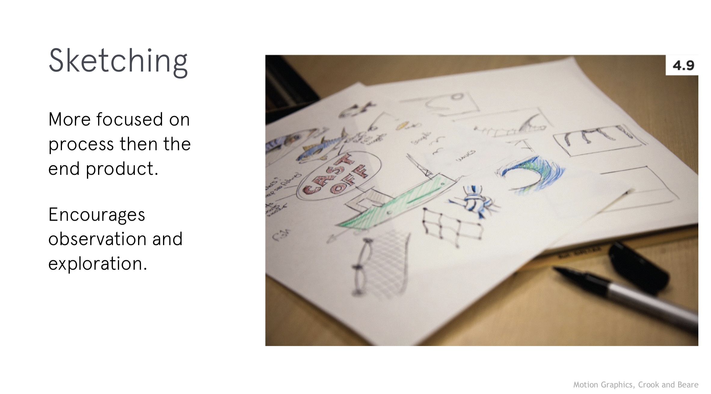
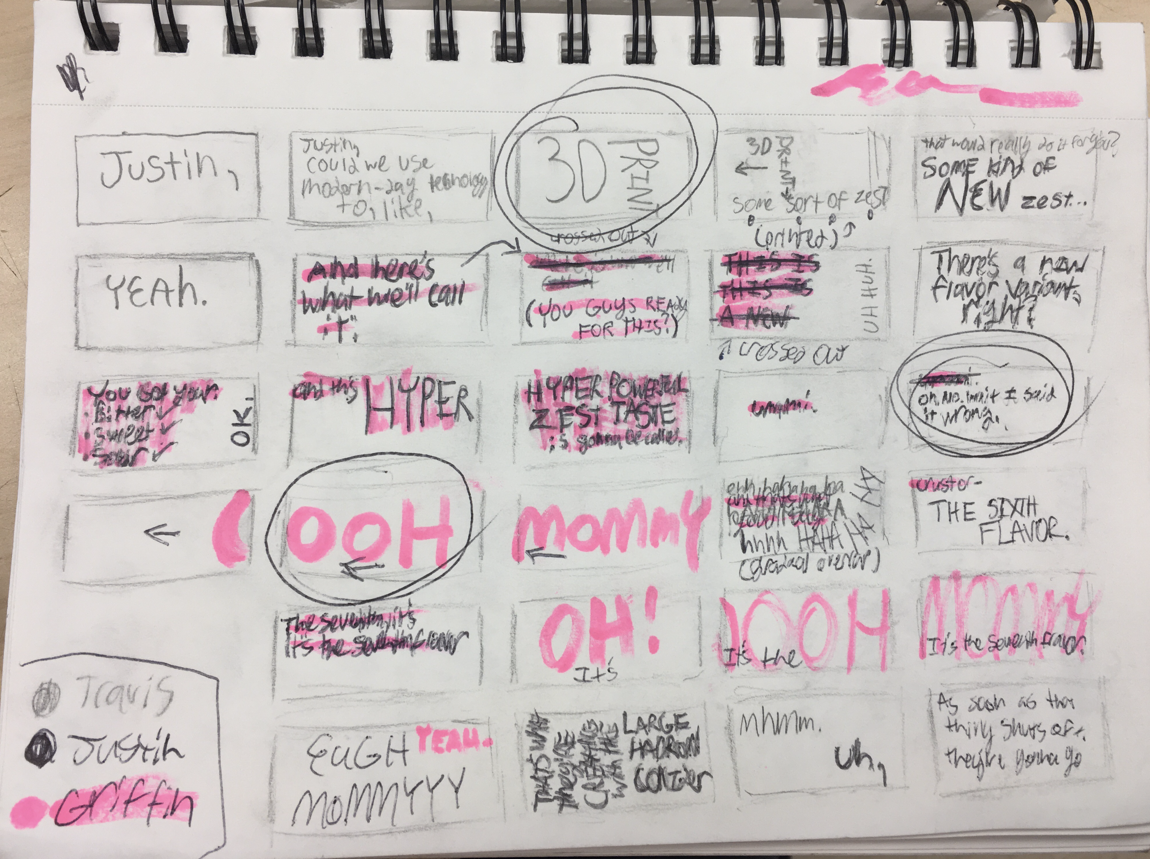
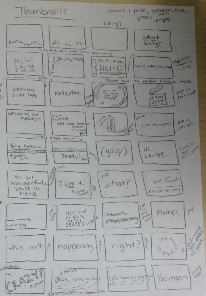
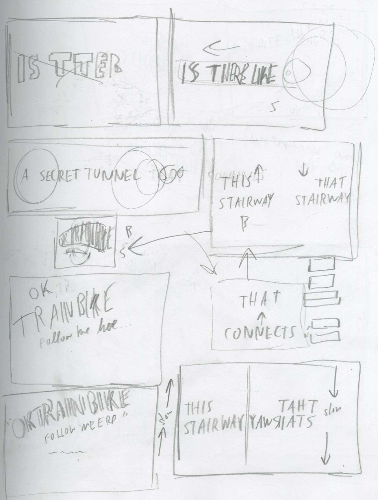
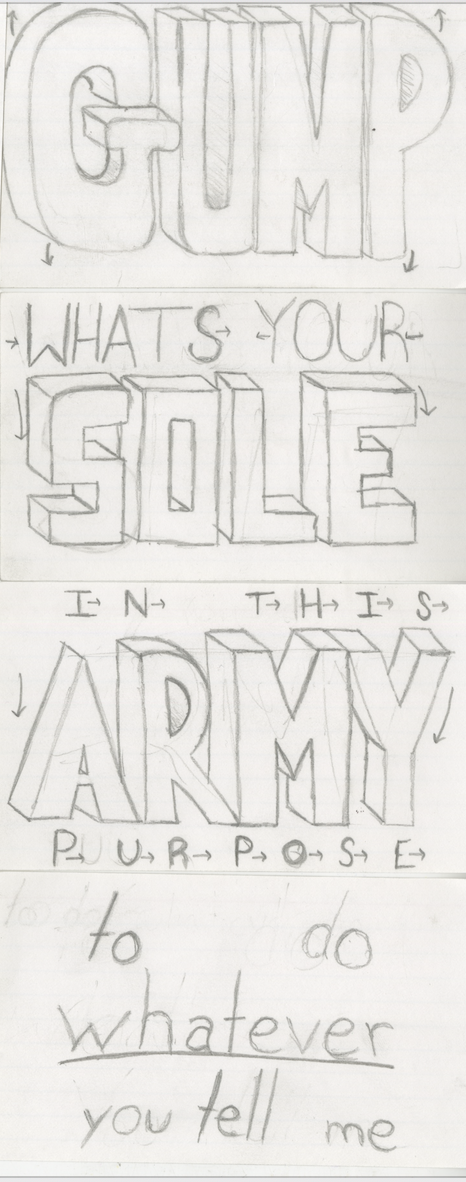
- P1 Thumbnail sketches (photo document all sketches) + Ideation:
- Quick, loose drawings that capture your first ideas for how type might move and behave in sync with your audio. These are not polished, but they help you brainstorm. Sketching first helps you generate many options quickly, focus on concept, and avoid getting “stuck” in After Effects too soon. Get started:
- Start by writing keywords/qualities that describe the emotion, pacing, or mood of your audio (e.g., “playful,” “urgent,” “melancholy”). Consider the mood of the characters.
- Draw little frames that show how words might enter, move, or exit. Think about rhythm (fast vs. slow), scale (small vs. big), and placement (center vs. off-screen).
- Don’t worry about style yet—focus on storytelling and motion flow.
- P1 Type Exploration + Moodboard:
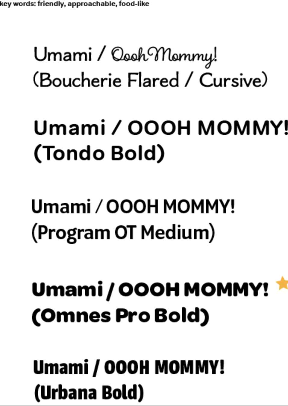
- Type: Since this project is entirely about type in motion, your typeface choice will drive the tone. For example, a blocky sans serif feels bold and urgent. Consider how you want the type to FEEL. Since the first project is rooted in typography, this can be merged with the moodboard. Get started:
- Choose 1–3 keywords (e.g., “chaotic,” “lighthearted,” “serious”).
- For each, pick 3-5 typefaces that embody that feeling. Explore stylistic tweaks like all caps vs. lowercase, stretched vs. condensed, bold vs. thin.
- Consider non-digital type: hand-lettered, photographed letters, textured/tactile type. Import those into AE to animate.
- Resources:
- Typewolf Inspiration – curated examples of type in use.
- Fonts In Use – see how fonts work in real-world projects.
- Google Fonts – free to download.
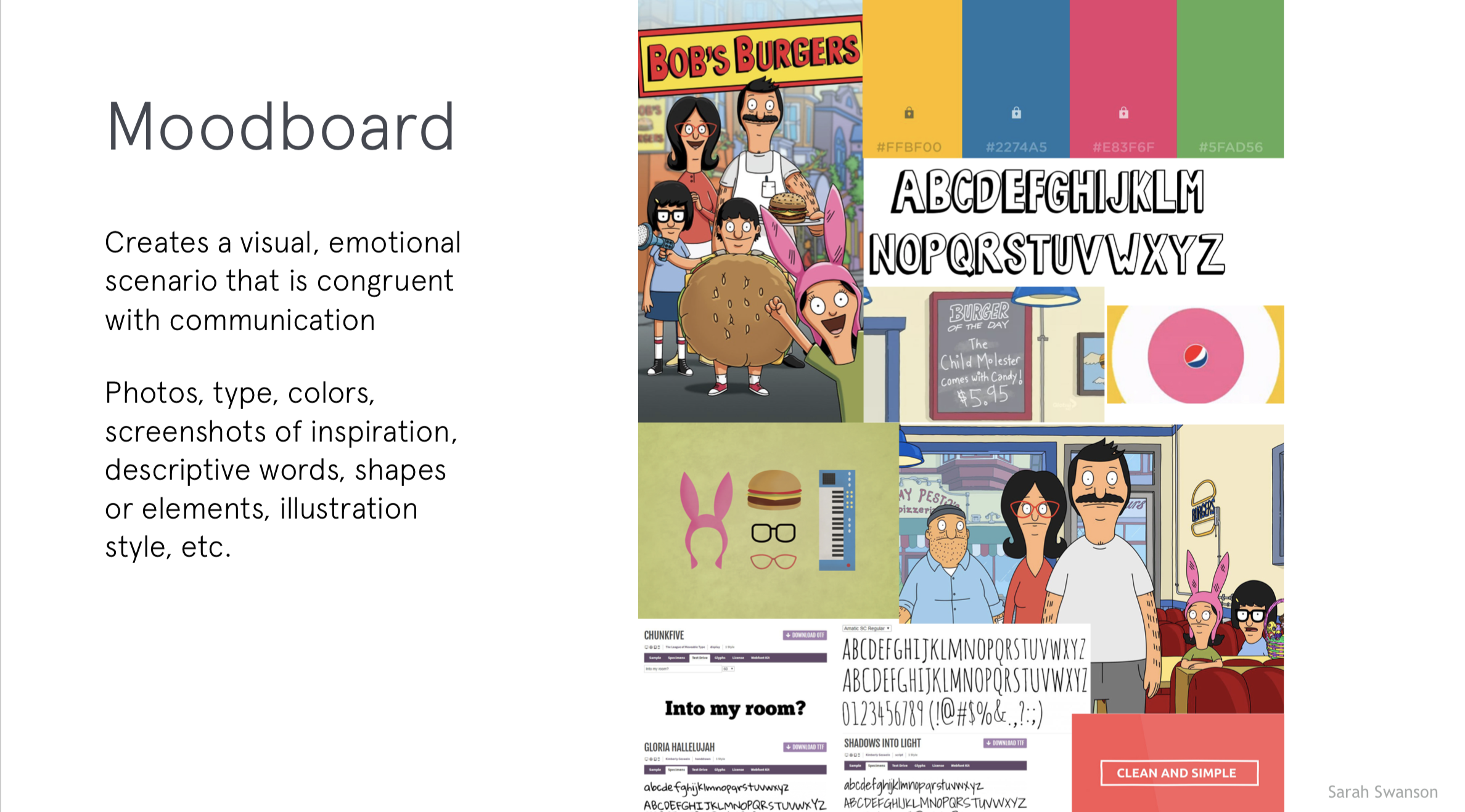
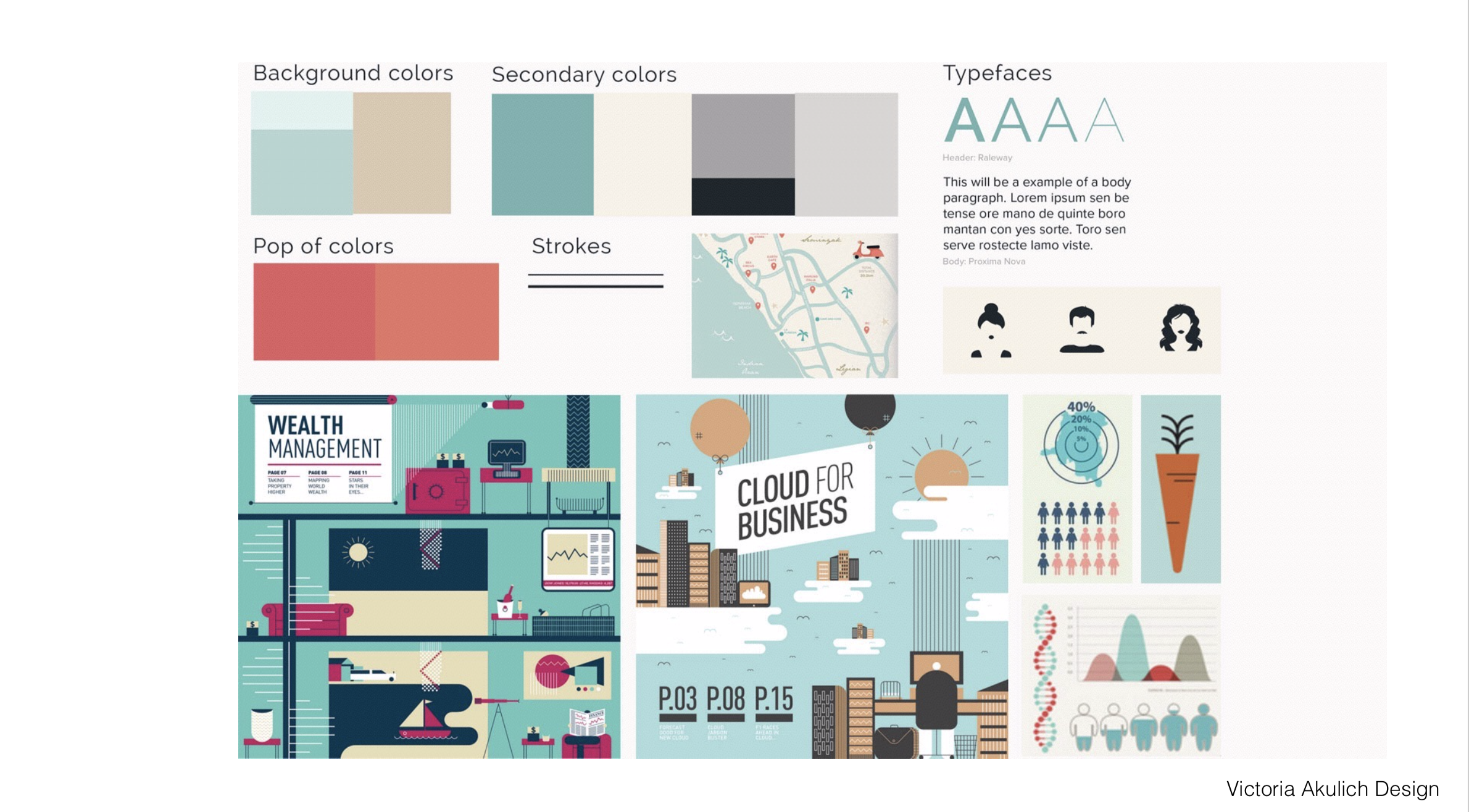
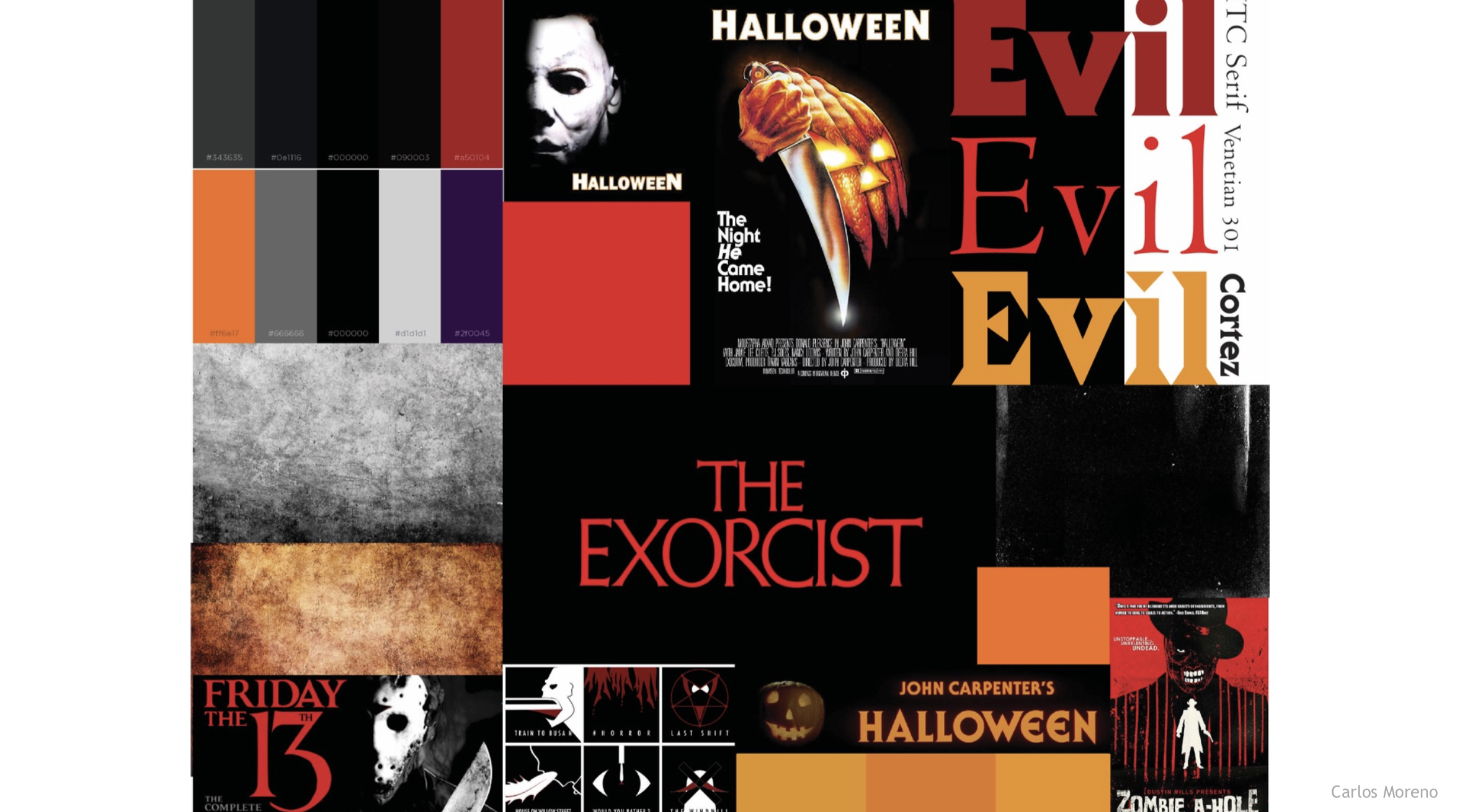
- Moodboard:
- A collection of visuals (colors, textures, type examples, design references) that define the overall look and feel of your piece. It ensures your final animation feels intentional and cohesive. Get started:
- Collect pieces of inspiration: typography samples, color palettes, textures, or imagery that reflect your concept.
- Organize them in one board (Adobe Illustrator, Photoshop).
- Make sure your type exploration feeds into this—include your test typefaces.
- Can be helpful to add notes that connect each choice back to your keywords.
- A collection of visuals (colors, textures, type examples, design references) that define the overall look and feel of your piece. It ensures your final animation feels intentional and cohesive. Get started:
- Type: Since this project is entirely about type in motion, your typeface choice will drive the tone. For example, a blocky sans serif feels bold and urgent. Consider how you want the type to FEEL. Since the first project is rooted in typography, this can be merged with the moodboard. Get started:
AE Handout: Intro to After Effects
Project 1 Schedule
- 9.2 – Demo: Interface Review/Keyframe Basics/Shapes/Single Compositions+Layers /Importing/Text Tool; Exercise 1; Due: P1: concept development, thumbnail sketches, typeface exploration and moodboard
- 9.4 – P1 3 Styleframes Due; Vimeo Setup; P1 Crit #1 – Styleframes
- 9.9 – Demo: Compositions/Masks/Audio Sources; Lecture: Motion Design Process; Small Group Crit
- 9.11 – Demo: Keyframe Interpolation/Time Remapping/Parenting/Graph Editor/Audio; Exercise 2; P1 Crit #2 (10s)
- 9.16 – Demo: Track Mattes; Lecture: History of Motion Graphics; Studio
- 9.18 – P1 Final Crit #3 (30s)
- 9.23 – Lecture: Principles of Motion Graphics; Studio
- 9.25 – SUBMIT P1; P1 Final Presentation; Begin P2