Welcome to Motion Design!
I’m thrilled to begin this journey with you as we delve into the dynamic realm of visual storytelling through motion! With class opening on Monday, your first review is pre-recorded to allow flexibility. Cass will be live Wednesday, August 27th @noon for mid-week 1 check-in and to answer any questions you may have.
📌 Weekly Structure (applies every week)
- Content Release: Mondays @ 11 AM (Tues @ 11 AM if holiday week)
- Deadlines: All assignments due Mon @ noon (or Tue when no Monday class)
- ZOOM : Optional. Monday review + critique (recorded). If no Monday class → prerecorded review + Wed @ noon live session.
- Critiques:
- Regular weeks: Mon @ noon → Wed @ noon
- No Monday class: Tue @ noon → Thu @ noon
- Use discussion board if not in ZOOM
- Remote Office Hours: Wednesdays, 1–3 PM → Schedule Here
Week 1+2 Links & Notes
(specific to this week)
- 📹 Watch Now: Syllabus & Week 1 & P1 Intro (pre-recorded) → [Watch Here] 1h1m
Live Sessions This Week:
👉 Join Live: Wed 8.27 @ noon (Mid-week 1 check-in)→ [Join Here]
📺 Watch Later: Wed 8.27 Check-In Recording → [Watch Here] 18m
Looking Ahead (Week 2)
- Week 2 opens Tues Sept. 2 @ 11 AM (holiday adjustment)
- Week 1 deadlines extended to Tues Sept 2 @ noon
- No Monday (9.1) live session → prerecorded review posted Tues
- Next live (recorded) session: Wed Sept 3 @ noon (only live session in Week 2)
This week’s deadlines:
Tuesday, Sept. 2 @ noon
- Kinetic Typography Research + Reflection:
- Find 2 strong examples of kinetic type and post your notes to the Motion Design Kinetic Type Research F25
- Medium Post – Kinetic Typography: Ideation
- Create a new Medium Story called “P1: Kinetic Typography”. Create one post that includes all of the following:
- P1 Audio Selections: Research 3 clips (30–60s) and pick your final. Share links or upload recordings (Quicktime may be helpful).
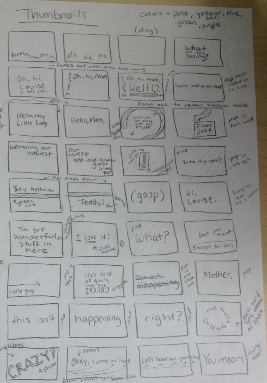
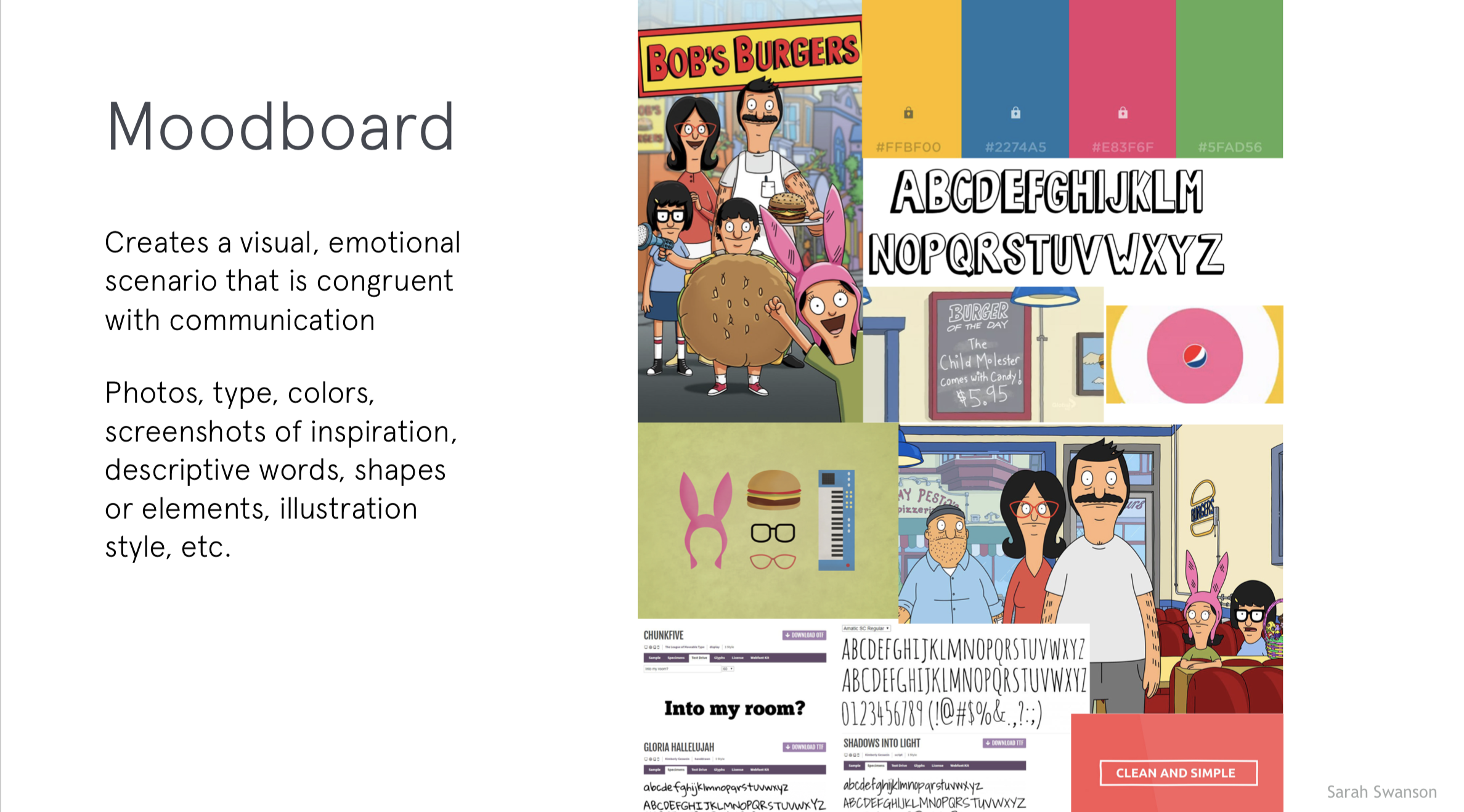
- P1 Process: Upload thumbnail sketches, ideation notes, type exploration, and moodboard.
- Email Cass (creese@pennwest.edu) your published Medium link so it can be added to the course site.
Next week, we will move on to P1 – 3 styleframes + P1 Crit #1, AE Demos, Exercise 1, and Lecture: Motion Design Process
Weekly Content
Week 1 (The tasks below are all of your items to complete this week. This corresponds with the checklist on D2L. Though not required, it is recommended you move through in sequence. All items need to be completed by next Monday @noon)
✔️ Track your progress on our weekly checklist on D2L > Content.
- Course Introduction (Recording 1)
- Review Syllabus – Online Section (Recording 1)
- Complete Survey + Syllabus Agreement
SECTION I – Course Intro (Syllabus + First Lecture) - Watch Lecture Video #1 – Lecture: Intro to Motion Design (33m)
- Review Intro to Motion Design Resources
- Read: Motion Literacy, by Jan Kubasiewicz
SECTION II – P1 Introduction (Research + Audio + Sketches) - Begin P1 Kinetic Typography (Intro in Recording 1)
- Review list of P1 Examples
- Due next Tues: Complete Kinetic Typography Research + Reflection – post here: Motion Design Kinetic Type Research F25.pptx
- Create your free Medium account (click “Get Started”) and copy/paste within course survey OR email to creese@pennwest.edu + Email Cass Team Names
- Due next Tues.: Audio Selections
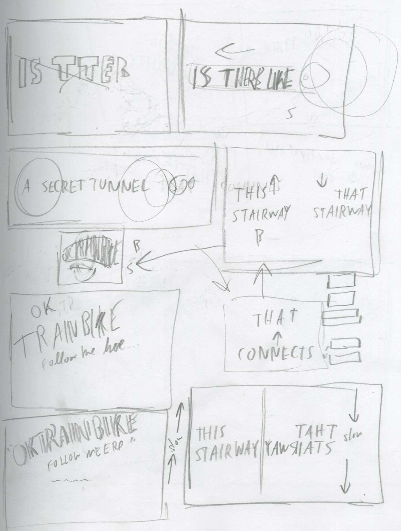
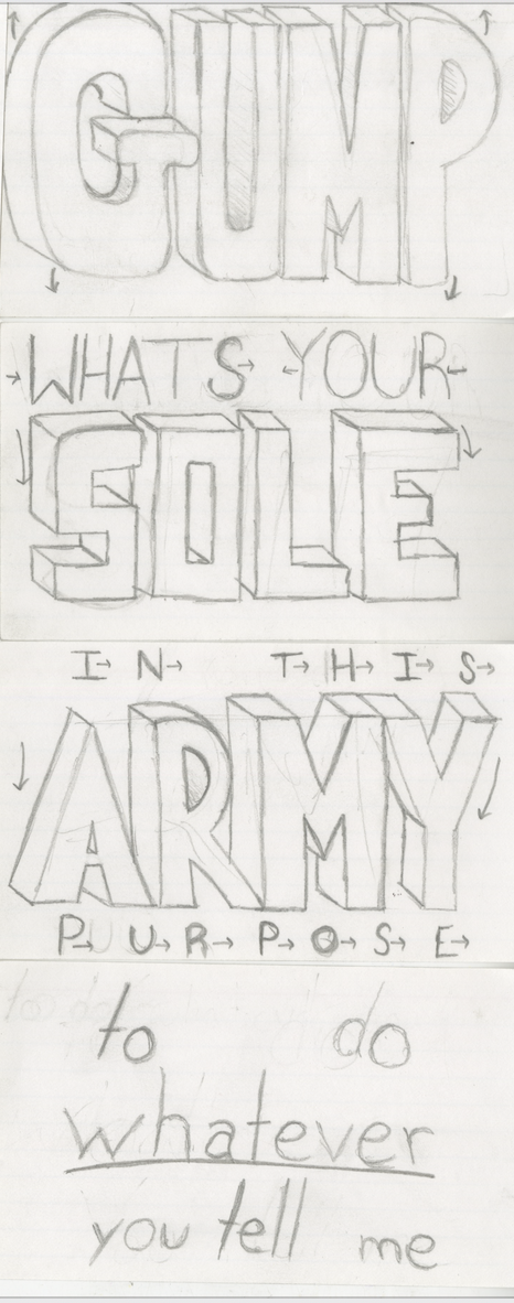
- Due next Tues.: P1 Thumbnail Sketches
- Due next Tues.: P1 Ideation
- Due next Tues.: P1 Typeface Exploration
- Due next Tues.: P1 Moodboard
SECTION III – Intro to After Effects (Interface + Keyframes) - Watch Demo Videos: Intro to After Effects
- Review After Effects Resources
- Practice in AE using keyframes and animating shapes
SECTION I – Course Intro
4.
Intro to Motion Design
In this section, you will find lecture videos, files, resources from the lecture and beyond, a relevant reading, and a resource video that expands on “what is motion design.”
Video #1 – Lecture: Intro to Motion Design
When I first started out, I would just jump right into design. I would try to design my way out of a problem and sometimes that works. But, more often than not, you end up a dead end. It definitely helps to know what the concept is first and design from there.
5. Intro to Motion Design Resources
Designed by Apple
Unsatisfying
IFC Branding
Build Something Great for CircleCI
The Power of Like by Vucko
Len Lye – Kaleidoscope (in video lecture above)
Coolbeans (in video lecture above)
Hannibal Title Sequence (in video lecture above)
Symmetry (in video lecture above)
Fritz Heider and Marianne Simmel (in video lecture above)
What is Motion Design?
6. Read: Motion Literacy, by Jan Kubasiewicz
SECTION II – P1 Introduction
For project 1, use type creatively through various typographic treatments such as manipulating the tracking or leading to create rhythm; changing the opacity, size, or weight to create contrast; distorting through pulling, pushing, or blurring; exploring outlines, layering, or using type as a texture. Keep placement and transitions consistent. Allow enough time for the viewer to read text. Video review of project 1 is in Monday’s zoom recording above.
8. P1 Examples
9. Kinetic Typography Research + Reflection
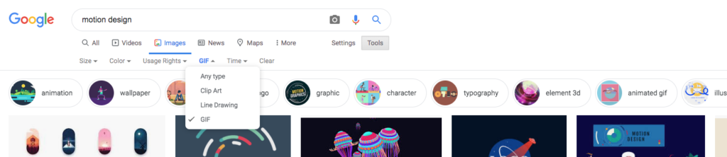
- Research 2 examples of successful kinetic typography. I recommend searching for examples that are either GIFs or include links (with screenshots) to examples on a specific website. GIFS can be saved. If using Google Images, you can go to Tools > Type (GIFs) to search for an example (reference screenshot below). Post examples to the Motion Design Kinetic Type Research F25.pptx.
- Kinetic Type Reflection: Why do you feel these two examples are successful? Craft a thoughtful reflection (approximately 75-125 words each), diving into the essence of your chosen kinetic typography examples. Consider concept, visual style, timing, sequence, use of story/narrative, etc. Share insights into the visual elements, stylistic choices, and mood that caught your attention. Discuss the effectiveness of the design in conveying the intended message or mood. Focus on the typography’s relationship with motion, and delve into any intriguing design techniques that enhance the viewer’s engagement. Feel free to touch on aspects such as color, font selection, pacing, and visual effects. Aim to provide a concise yet insightful analysis that showcases your critical thinking and artistic observation. Post your reflection next to your Kinetic Type examples in the Motion Design Kinetic Type Research F25.pptx.
11. Audio Selections
Post to “Kinetic Typography: Ideation” on Medium
- P1 Audio selection: Find 3 potential selections for your audio (30s–60s). Youtube has clips you can record via Quicktime (use an internal mic). If there is one you have in mind, you can often find it with a Google Search. Also, check out http://www.moviesoundclips.net/movies.php, http://www.moviesoundclips.net/tv.php, https://www.soundboard.com/category/Movies
- Reflect and brainstorm on how each might be able to be expressed typographically. Conceptualize. Consider: how does this audio feel? pacing? Go into as much description as you can. Keep any notes/sketches for your process work.
P1 Ideation
Post/Post to a story called “Kinetic Typography: Ideation” on Medium. How to post on Medium.
12. + 13. P1 Thumbnail Sketches + Ideation
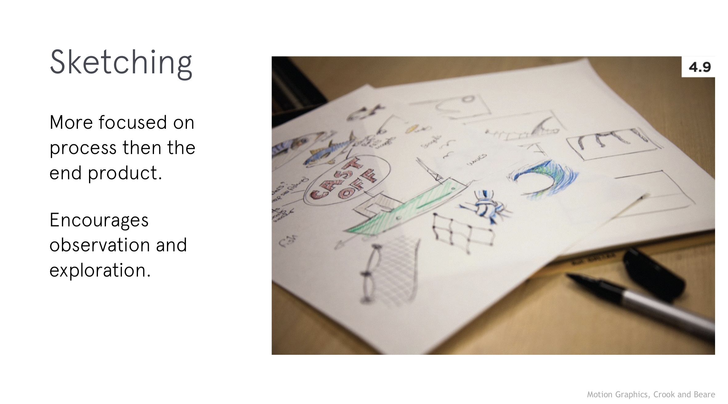
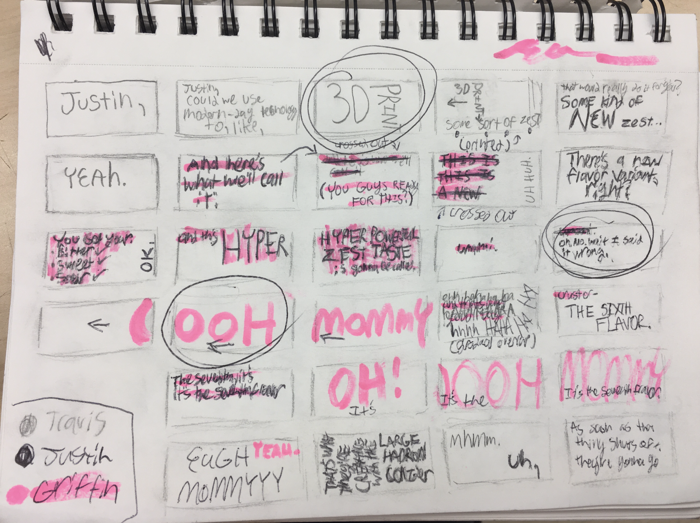
- Quick, loose drawings that capture your first ideas for how type might move and behave in sync with your audio. These are not polished, but they help you brainstorm. Sketching first helps you generate many options quickly, focus on concept, and avoid getting “stuck” in After Effects too soon. Get started:
- Start by writing keywords/qualities that describe the emotion, pacing, or mood of your audio (e.g., “playful,” “urgent,” “melancholy”). Consider the mood of the characters.
- Draw little frames that show how words might enter, move, or exit. Think about rhythm (fast vs. slow), scale (small vs. big), and placement (center vs. off-screen).
- Don’t worry about style yet—focus on storytelling and motion flow.
14. P1 Typeface Exploration
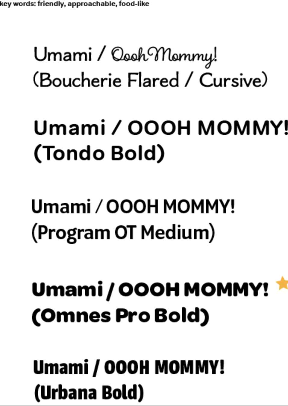
- Since this project is entirely about type in motion, your typeface choice will drive the tone. For example, a blocky sans serif feels bold and urgent. Consider how you want the type to FEEL. Since the first project is rooted in typography, this can be merged with the moodboard. Get started:
- Choose 1–3 keywords (e.g., “chaotic,” “lighthearted,” “serious”).
- For each, pick 3-5 typefaces that embody that feeling. Explore stylistic tweaks like all caps vs. lowercase, stretched vs. condensed, bold vs. thin.
- Consider non-digital type: hand-lettered, photographed letters, textured/tactile type. Import those into AE to animate.
- Resources:
- Typewolf Inspiration – curated examples of type in use.
- Fonts In Use – see how fonts work in real-world projects.
- Google Fonts – free to download.
15. P1 Moodboard
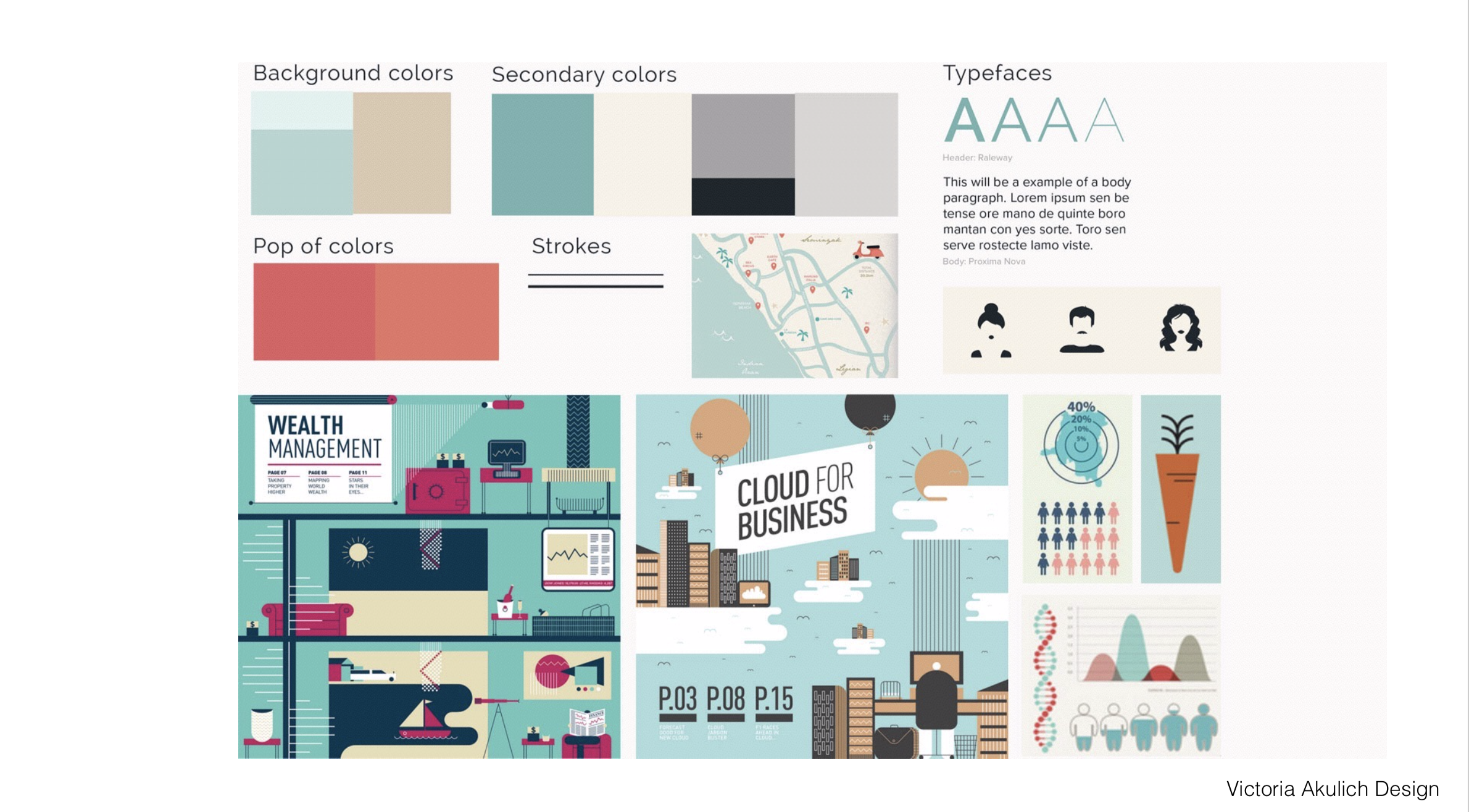
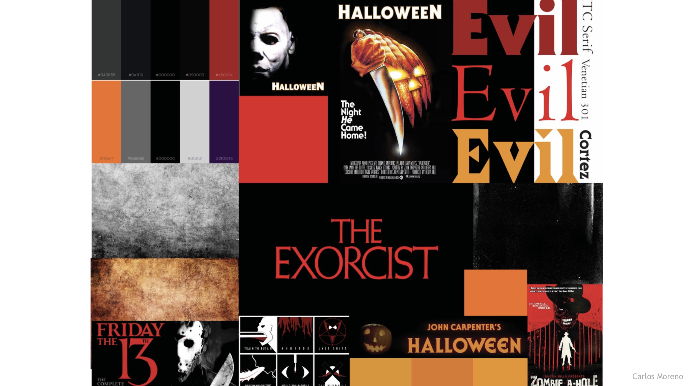
- A collection of visuals (colors, textures, type examples, design references) that define the overall look and feel of your piece. It ensures your final animation feels intentional and cohesive. Get started:
- Collect pieces of inspiration: typography samples, color palettes, textures, or imagery that reflect your concept.
- Organize them in one board (Adobe Illustrator, Photoshop).
- Make sure your type exploration feeds into this—include your test typefaces.
- Can be helpful to add notes that connect each choice back to your keywords.
Visual References:
SECTION III – AE IntroDUCTION
16. Intro to After Effects
In After Effects, this week includes an interface overview, panel setup, compositions, and an introduction to keyframes. Please watch the videos below, review the resources, and practice creating keyframes. The handout below can be used for quick reference while working through the application. Next week, we will have our first exercise in AE.
AE Handout: Intro to After Effects
17. After Effects Resources
- Watch (as needed): The After Effects Interface (15m)
- Review: What are Keyframes
- Review: Animation Basics (read about Keyframe; stop at Expressions)
note: AI usage policy
In our design courses, while AI tools can be valuable tools, they should never replace your fundamental creative process. Students are encouraged to first engage in traditional brainstorming, sketching, and conceptualizing to develop their own creative voice. When using AI, whether for design inspiration or minimal writing assistance, the emphasis should be on enhancing personal creativity rather than substituting it. Any use of AI-generated content must be appropriately modified to reflect your originality and authorship. It’s essential to cite any AI tools used in your creative and written work, maintaining academic integrity. This policy ensures that while embracing current technology, we also foster essential skills in creativity, critical thinking, and writing.